Most color problems are really light problems, but nobody tells you that when you open your first thread kit. My first paid job came from an HVAC company that wanted their blue and orange logo stitched on a dozen polos. I studied the logo under the ceiling light, picked a blue spool that looked like the picture, and ran the entire order. When the owner arrived for pickup, he tilted his head and said the blue looked purple. It did. That is how I learned to stop trusting my eyes under a bad bulb and start treating thread color like a number, not a feeling.
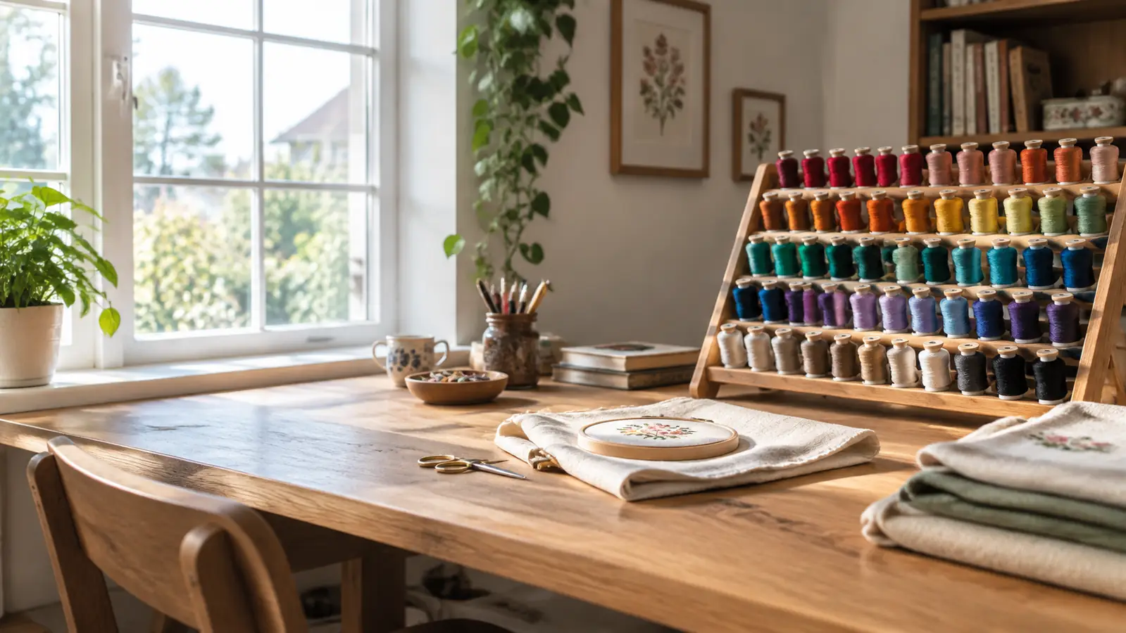
I run my embroidery business from a spare bedroom in Macon, Georgia, on a used six-needle machine I bought in 2019. I stitch hats, left-chest polos, towels, and canvas bags for youth teams, churches, a few small companies, and a barbecue place. For the first year I matched thread by squinting at screens and hoping, and I wasted spools and confidence. These days I keep a New brothread 40-color polyester thread kit on a rolling stand beside my work table. It is the palette I reach for when a customer hands me a logo with a color I have not stitched before. This article is the sequence I actually use.
Start with a full range of colors
Keep the New brothread 40-color kit on your stand so every close candidate is within arm's reach. You cannot compare what you do not have.
Amazon Check Today's Price on Amazon →Step 1: Start With the Real Logo, Not a Screenshot
Ask for the original vector file, a PDF from the team's website, or a branding guide with Pantone values. If the customer is a booster club or a church office, they often have a PDF but they do not think of it as a logo file. Ask them to email the one they use when they order t-shirts. Then print it on plain white printer paper. Do not print on glossy photo paper because the gloss changes the way light hits the ink. A matte print on standard paper keeps the color as honest as a home printer can manage.
Do not make the final color call in your stitching room. I say this because my space has a window on the left wall and fluorescent tubes overhead, and those two light sources never agree. A navy thread will look almost black directly under the fixture and turn noticeably blue when you step closer to the window. Instead, take the printed logo and the fabric you plan to use to a spot with even daylight. For me that is the dining table near the front door. Put the logo on the fabric and walk around it. This is the first pass at a match, and it has to happen in light you can trust.
While you still have the customer on the phone, ask one question they rarely expect: what surface will the finished product be seen on? A logo stitched on a black polyester ball cap behaves differently from the same logo stitched on a white cotton-blend polo. Dark backgrounds hide depth in dark colors. Light backgrounds make pale colors look thin. Knowing the base fabric before you pull a single spool is what separates a considered color match from a guess, and it costs you only one sentence.
Step 2: Compare Thread Spools Under the Same Daylight
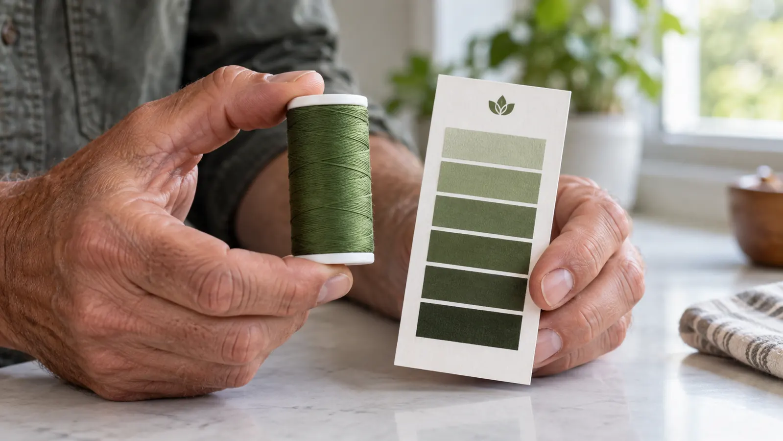
The New brothread 40-color kit comes with a paper chart, which I keep clipped to the inside of the rolling stand. The chart is a useful grouping of color families, but it will not make the decision for you. Printer ink cannot reproduce the exact dye of a polyester thread, and every screen shifts everything. So do not hold a phone up to the chart and pick the color that looks right in a photograph. Hold the actual spool next to the actual print. The physical thread reflects light in a way that no glossy page can capture.
Pull spools the way you pick paint chips: bring home every shade that is anywhere close, then lay them on the surface and narrow down. For a cardinal red, one spool will lean orange, one will lean burgundy, and one may land exactly between them. Set the candidates side by side on the printed logo. Stand back about three feet and squint just a little. Then pick up each spool and lay it directly on the fabric you will embroider. The fabric underneath will change how saturated the thread appears, so the final two candidates need to be judged on the real shirt, not on the paper print.
Another trick that costs nothing is to cut a small hole in a piece of plain white paper and slide it over the printed logo. The hole isolates one color, which helps you see how that color is affected by the neighbors around it. Red next to orange looks different than red next to gray. If the logo has several colors, isolate each one and compare separately. That small trick taught me more about matching than any tutorial, because it forced my eyes to focus one color at a time.
Step 3: Make a Small Sample Before You Make a Single Shirt
Once you have narrowed the candidates, stop comparing and stitch. I know waiting for a sample feels like slowing down the order, but it is faster than redoing a full run. Load the two or three finalists into adjacent needles on my six-needle and stitch a small test that uses the actual design element you are most worried about. Use a short satin stitch and a small filled shape, because a thread can look perfect in a thin line but muddy in a large area. The sample is your final vote and it cannot be done on paper.
Use the exact stabilizer, needle, and backing you plan to use for the production run. If you are stitching a left-chest logo on a polo, put tear-away on the back exactly as you would in production. If you are doing a hat, hoop the hat or use a cap frame, do not do a flat test on scrap fabric. The difference between a flat test and a curved cap test can matter enough to change the perceived color of a thread. And do not forget to stitch with the same number of layers of topping. Every layer changes how much the thread sits on top of the fabric.
Set the machine to a realistic speed and use the same stitch density as the final file. That is the part most tutorials skip. If you run a sample at half speed with light density, then produce at full speed, the thread coverage will look different. The bobbin tension may not be changed, but the buildup of stitches affects the way the color reads. Write the file name and the spool numbers on the sample with a permanent marker. You will need that note in a minute.
Step 4: Judge the Sample Like a Customer Would
The hardest part for me is learning to look at a sample the way a customer will. When a sample comes off my machine, it has just been under bright needles and moving metal, and my instinct is to grab my phone and zoom in. That is wrong. I take the sample to the doorway and hold it at the distance a customer uses when they look at a finished order. For a left-chest logo that is around two to three feet. For a back graphic on a work shirt, step back five feet. You are not inspecting the stitch density; you are checking whether the color reads as the logo color.
Set the sample next to a sheet of plain white printer paper. White is your reference point. If the sample looks darker or cooler than you expected against the white, you have your first honest clue. Do the same comparison against a black piece of fabric if the order includes dark items. I once spent a full evening matching a royal blue for a church. Under my work light it looked right, but when I put it on white cotton it looked purple. The New brothread kit had a slightly different royal spool, and that one was the true match for the customer's shirts.
Do the same test under the lighting where the product will live. For a barbecue restaurant, walk the sample to the dining room and lay it on the table. For a youth baseball team, go outside in the sun. If the customer is ordering online and you cannot see their space, ask one question: is the logo going on something worn mostly outside or mostly inside? That answer tells you whether to trust your window test or your fluorescent test. Cloth changes color as light changes, and this step catches the mismatch no screenshot ever will.
Step 5: Write Down the Exact Match Before You Clean Up
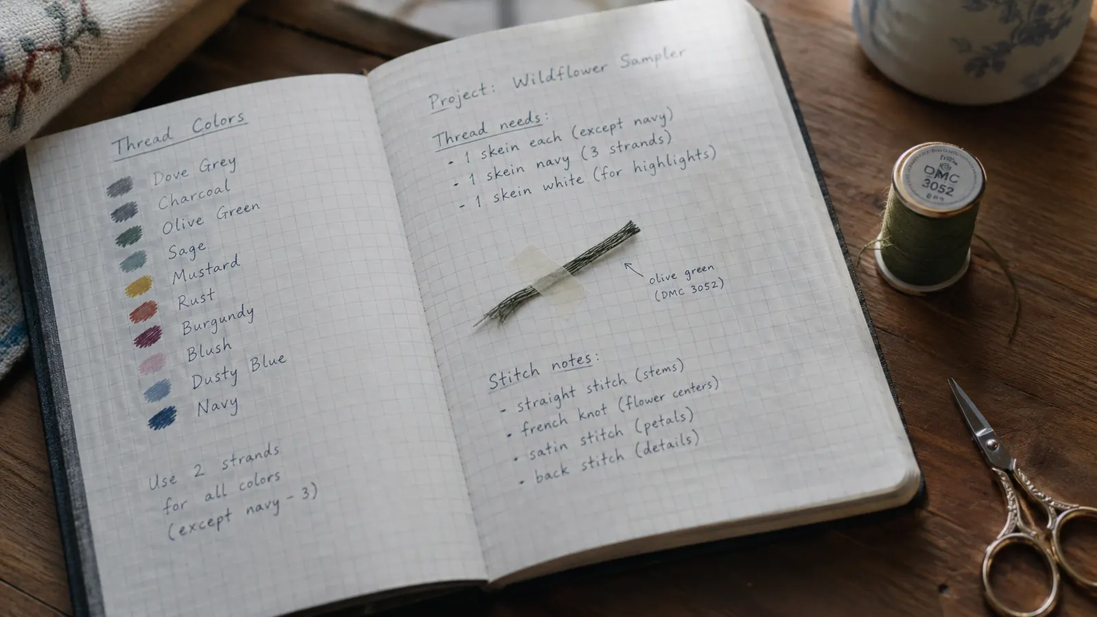
When a color passes the daylight test, the fabric test, and the distance test, take the sample and write down the exact match before you do anything else. The worst feeling in this business is having to repeat a color search a month later because you did not write down what you learned. I keep a composition notebook on the table next to my six-needle. For each job I write the customer name, the order date, the fabric color and fabric type, the spool number, and the slot in the thread case where I found that spool.
If your customer is the type who reorders every season, that notebook page is gold. A team will order one hundred hats in March and another fifty in August. If you can pull the exact thread without a new search, the second order takes a fraction of the time. When I finish a matched job, I also tear off a one inch piece of the thread and tape it in the notebook next to the code. Six months later, the physical thread does not lie about the color the way memory does.
I keep the New brothread kit organized by returning every spool to the same slot when the job is done. That routine means the second order from the same team takes me ten minutes instead of a half hour to set up. The whole point of a full color kit is that you can find what you need fast, but a kit is only fast if you can put your hands on a known spool without sorting through loose thread. Tidy kits and short notes are the forgotten half of color matching.
What Else Helps
There are a few extra steps I add when the match is difficult. First, always ask for a physical item if the customer has one in their hand. A signed shirt or a hat from their last order gives you a target you can lay your thread on. Photographs of that shirt will not do it. Second, take your own photos in daylight and label them with the customer name and the thread number that worked. I keep a simple album on my phone called Good Matches. When a new order comes in that feels familiar, I search that album before I pull spools.
Third, be willing to admit when a match cannot be exact. Some logo colors were printed with metallic foil or spot UV, and no single 40 weight polyester thread will duplicate that effect. In that case, choose the closest tone and tell the customer before you stitch, so they are not surprised when the finished piece does not glow. You can also suggest a small design change, like outlining the metallic color in a darker shade, so the finished logo reads correctly at a distance. That kind of honesty builds more trust than a thread color that comes close.
The last tool on my table is a cheap desktop lamp with a natural light bulb. I tried it after years of matching under warm yellow bulbs, and the difference was immediate. A natural daylight bulb does not pull colors orange or blue the way an ordinary bulb does. I position it so it does not glare on the thread, and I always stand sideways so my shadow does not fall across the spool. It is not fancy, but it gives me the same light at eight in the evening that I have at two in the afternoon.
The first HVAC blue I matched looked right under my desk lamp and purple on the customer's chest.
Make your next thread match the easy one
Set up a full New brothread 40-color kit on your stand once, and every future order starts with the exact spool already in front of you. This is the kit I keep beside my machine.
Amazon Check Today's Price on Amazon →